dm_detritus_v2
 HL2DM
HL2DM

dm_detritus_v2
by
satchmo
Posted 16 years ago2007-04-22 11:43:57 UTC •
Completed •
Half-Life 2: Deathmatch
Loading...

- Name
- dm_detritus_v2
- By
-
 satchmo
 - Type
- Map
- Engine
- Source
- Game
- Half-Life 2: Deathmatch
- Category
- Completed
- Included
- BSP
- Created
- 16 years ago2007-04-22 11:43:57 UTC
- Updated
- 16 years ago2007-04-26 01:22:07 UTC
- Views
- 6823
- Downloads
- 1212
- Comments
- 14
- Rating
- 4.00 (1)
- Reviews
- 0


Map Name: dm_detritus_v2
Mapper: satchmo (at www.GamingParents.org)
Release Date: April 23, 2007
Suggested Players: 2-8
No. of Secrets: two
Deathmatch Spawnpoints: 10
File Size (decompressed BSP): 3.47 MB
Map Size: 2,796 square feet
Total Compile Time: 3 min 56 sec
Total Triangle Count: 6,111
Direct Lights: 25
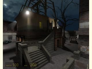
Map description:
"Detritus" is a biological term for particulate dead organic material. It typically includes the bodies of dead organisms, fragments of organisms or fecal material, and is normally colonised by communities of microorganisms which act to decompose the remnant.*
I made dm_detritus because there appears to be a shortage of good quality small maps designed for 1v1 gameplay. In addition, Ravenholm-themed maps are not plethoric.
I stayed up all night making this map, often skipping meals and bathroom breaks. I completed this map in less than five days. It's my pride and joy, built with blood and sweat.
Thanks to the Great Kasperg, this map now looks the way it should.
Enjoy.
*Courtesy of Wikipedia
Mapper: satchmo (at www.GamingParents.org)
Release Date: April 23, 2007
Suggested Players: 2-8
No. of Secrets: two
Deathmatch Spawnpoints: 10
File Size (decompressed BSP): 3.47 MB
Map Size: 2,796 square feet
Total Compile Time: 3 min 56 sec
Total Triangle Count: 6,111
Direct Lights: 25
Map description:
"Detritus" is a biological term for particulate dead organic material. It typically includes the bodies of dead organisms, fragments of organisms or fecal material, and is normally colonised by communities of microorganisms which act to decompose the remnant.*
I made dm_detritus because there appears to be a shortage of good quality small maps designed for 1v1 gameplay. In addition, Ravenholm-themed maps are not plethoric.
I stayed up all night making this map, often skipping meals and bathroom breaks. I completed this map in less than five days. It's my pride and joy, built with blood and sweat.
Thanks to the Great Kasperg, this map now looks the way it should.
Enjoy.
*Courtesy of Wikipedia
14 Comments
You must log in to post a comment. You can login or register a new account.
The layout works, but the visuals (and maybe ambience sound) need more work: Besides getting the light to compile right, you could use some more colors besides the usual whites and yellows, or at least make the white lights a bit more blue and the yellow ones a bit more orange.
Texturing seems ok in most places, but some of those textures (inside one of the buildings) where made to tile only horizontally and look bad when the bottom of the texture appears again on top. I would also change the tiles on the stairs, as they don't fit perfectly and end up being cut.
That's all I can say for now. It definitely has potential!
I think the lighting is error-free. The reason the shadows are extremely dark is that the ambient light is so dim. It is, after all, a night map. At least it looks fine on my computer.
I appreciate the suggestions, but I think I'm finished with this map. My wife will be coming back tonight (from a trip to her parents), and I have a grueling work schedule next week.
Thanks anyway.
Bloody fool i was when i told myself I'd give them all in-depth reviews. Bloody fool.
I kid of course. downloads and buzzes Livewire simultaniously
LET THE PLAYTEST BEGIN!
Please allow the humble satchmo bow down to you!
You're so right with the lighting error. I found a leak in the map that prevented light bounce calculation.
I also changed the textures for the stair steps. I changed some of the weapon placement and added more cosmetic improvements. I left the lighting as is though.
Thanks a million!!!
I made some screenshots in Snarkpit style with some architectural observations you can use in the future. They don't really affect the gameplay.
http://img258.imageshack.us/img258/5089/dmdetritusv20001ur4.jpg
http://img46.imageshack.us/img46/2058/dmdetritusv20002iy9.jpg
http://img46.imageshack.us/img46/5811/dmdetritusv20003fo9.jpg
http://img258.imageshack.us/img258/8765/dmdetritusv20000uw7.jpg
http://img250.imageshack.us/img250/1857/dmdetritusv20004ht5.jpg
I concur with all of your assessment. In fact, I share some of your ideas even before you suggested them.
I agree with the single-point intersection between two architectural elements. I think it looks better if the triangular supports extend out a bit further.
The brick ceiling supports are unusual, but I elected to texture them that way because it looks cooler. A concrete texture doesn't stand out as much from the decorative plaster ceiling.
The construction material of the taller building is strange, but I actually have a story in mind when I made it that way.
The section of Ravenholm for this map is the more upscale neighborhood. It's close to the City Hall (where the demolished skeleton of the building is visible through the heavy metal door).
That taller building used to be the mayor's mansion, but it has been destroyed during the Seven Hour War.
Squatters have built on top of the brick foundation, in addition to the adjacent metal shack and wooden structure. It's a town that has seen better days, and the various phases of construction are represented by the increasing dearth of good building materials (from brick to metal to wood).
This transition of material suggests the squalor of the current state and conveys a somber mood.
In that case, perhaps it should look a bit less rigid and perfect. Maybe different metal parts, something to make it look more improvised and rushed instead of looking so correctly assembled.
About the beams, you could always choose any color to paint the concrete!
http://img440.imageshack.us/img440/6507/dmdetritusv2overviewcw9.jpg
I'll be patient.
Make sure you got the latest version (v2) when you play.
by Satchmo
Architecture - 6
Texturing - 6
Atmosphere - 8
Lighting - 7
Gameplay - 8
Overall - 70%
A solid piece of mapping with only the occasional let-down.
Also, put a playerclip above the well, or raise the water level. You can fall down, but can't get back up.
Architecture is quite blocky in several places, and texturing is often bland and repetative.
The quality of the interior sections is very notably lower than the outside and this brings down the score of a map which could easily get in the high 80 percents.
Video playest: https://www.youtube.com/watch?v=7WmlBrY9ZCY
I'll check out the video right now.