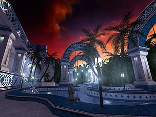
Riverpool
 HL
HL

Loading...

- Name
- Riverpool
- By
-
 Rimrook
 - Type
- Map
- Engine
- Goldsource
- Game
- Half-Life
- Category
- Completed
- Included
- BSP, RMF/VMF
- Created
- 15 years ago2009-01-06 11:09:42 UTC
- Updated
- 8 years ago2016-01-08 22:28:51 UTC
- Views
- 13449
- Downloads
- 1893
- Comments
- 40
- Rating
- 4.85 (13)
- Reviews
- 0

Someone actually has a download link to this so I updated.
40 Comments
You must log in to post a comment. You can login or register a new account.
[EDIT] Oh and the moving-leaves palm is just perfect for an outdoor map.
Habboi: Cuz much better looking stuff is everywhere... like in Ep2.
edit2: rimook I added you to friends .. you still didnt accepted :(:(
Really amazing, but .. I dont like the fact that you suddenly get blocked because your not supposed to go there. Like with the waterfall, you can remove the clipping. And only clip around the rocks. That looks much better.
Also you can add fades to the end of both side of the map. Then when you fade is almost 100% you restart the round. Then it looks much more natural then just a transparant wall there.
The rest, custom textures/model are superb. Maby the lights are a bit to much. But it gives a good feeling
Also, when you spawn and you walk to the pool. Look at your left .. there is a black palm model. It looks ugly
I give 4½ stars. But because that doesnt excist .. ill give 5 !
Raver: Add friends to what?
Anyways, why do all the models that have transparent textures look like they have no transparency but instead, a black background. Is it because of WON hl?
http://www.cryotank.net/stuff/transparency_dlls.zip
It doesn't look like you are using any default textures, so you could just use -nowadtextures to include all used textures in the .bsp (less work than -wadinclude)
It looks amazing, but it has issues as a map in general. For goldsource, wpoly of 2500 and epoly of 40,000 is ridiculous. It's easy to make a pretty HL1 map when you build it like it's made for HL2! But regardless, the architecture, texturing, lighting, sound ambience, etc. are wonderful. It's clear that those polies went to good use, and aren't just the result of sloppy mapping.
In terms of gameplay, the way so much of the map is clipped off is frustrating. I've had to do those a couple times myself, but when you feel like there's an invisible barrier all around the map it's just irritating.
It feels like a pretty setpiece, but not something that's really meant to be played.
Oh and pretty much what everyone said.
This looks absolutely breathtaking just from the screenie. I'm amazed at all the quality maps being produced for this little project... <downloading now>
I was about to slit my wrists o__O
BTW, i still map and do everything on WON-HL
http://www.podcast17.com/transmissions/c10751
Though I REALLY liked how the trees swayed in the wind; it made the map feel alive. I don't think I've ever seen another map that did something like that.
The only complaint I have is that you clipped off the waterfall area. I wanted to get closer, but I couldn't, and many tears were shed.
This map blew me away from the screenie and the actual map was even better than i imagined. I was really like "holy shit" and "fuck" walking through the map...simply sexelent.
++Rimrook Textures never disappoint = )
+Superb brushwork, if not a bit thick or blocky on some trims and pillars imo.
+custom sky
+Lighinng
+Neat fake HDR if not a little overdone
++Rimrook Models. Though the sexy gir's face was a little man-ish imo! = )
++excellent use of transparent textures for the trees
++excellent use of sounds
The only other comment i can think of atm is i felt as if the map in general felt like it was scaled a little too big. I think if you shrunk everything by 1/3 or a little less it would be even better.
Oh btw i did notice some disappearing brushes in the river in places, and i think srry mentioned that the "max viewable distance" could be increased, since some stuff disappears if in a few parts of the map.
Simply superb work. 5 all the way...
* * * * *
The only thing I think could use improvements is lighting. It's got an absolutely lovely duskish skybox, yet the area's flooded with flourescent bluish/white. Toning down the brightness and giving it a more natural warm tone would really improve the map's serene feel.
Clipping out areas is usually somewhat frustrating; I can see why you'd do it with trees, though areas like the waterfall should stay unclipped.
5* for the huge effort nonetheless (chaeng lightningz pl0x!)
Loved it! sure, you clipped off some of the most senic areas, but the brushwork and ambience was amazing. The girl was'nt as man-ish as CT would have me believe, but I think you should work on her a bit, make the porportions a bit more realistic. Great rooms entry, you could base an entire mod off of this. (Rimrook's Mansion - That would be awsome! At least consider it next time you have some free time to work.)
5 stars for effort, brushwork and ambience.
Very cool transition sequence from outside the area "jungle like trail" to the pool area. Wonderful surroundings. The girl was a very nice touch though her face could be a little more feminine looking and less round. I wasn't extremely fond of the building with its huge door and the statue though it does have tranquil form and compliments the theme. The pool could have possibly used one more bridge but with only one it secludes the inner side more so it may have not been necessary.
Good job dude this pool is sexy as hell! I'd say this was the best "room" done in the project and deserves some recognition! Have you considered being an architect?